CASE 04 / DESIGN DIRECTION & GOVERNANCE · MULTI-PLATFORM SYSTEM
The System Behind the Products
Giving the company's digital products a dependable way to look, behave and communicate.

01
CASE FILE
Owned: the digital interpretation of the brand, typography and colour foundations, Figma variables, semantic roles, component-state guidance and cross-platform design direction. Worked with: brand stakeholders and engineering across products and stacks. The brand agency set the identity direction; making it work in digital products was my responsibility. The brand direction established an identity, but teams still needed answers to everyday questions: how much emphasis belongs on a dense reporting screen, how an action differs from feedback, what changes in dark mode or an error state. Heavy use of the strongest brand colour risked everything competing for attention. I treated visual stability as a problem of attention, recognition and meaning, and the foundation had to let teams decide consistently without a review from me.
02
STRATEGY · DESIGN DIRECTION
I translated brand intent into product rules for typography, surfaces, actions, feedback and the distribution of colour. A treatment that works in a campaign may need a different expression in a small control, a data-heavy workspace or a payment flow. I explained each decision through product requirements and kept it aligned with the brand’s owners.
Trade-off:
visible differences from marketing material, which need a clear purpose and ongoing alignment.
03
ARCHITECTURE · FUNCTIONAL COLOUR FRAMEWORK
Colour guidance is organised around four interface roles: Marketing, Transactional, Data and System Feedback. Marketing carries more brand expression; transactional screens need a clear action hierarchy; data views let the information lead; system feedback needs a meaning that’s recognisable in context. This makes colour a decision about function rather than preference.
Trade-off:
consistency doesn’t mean the same amount of colour everywhere, so the family resemblance has to survive purposeful differences.
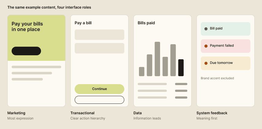
Functional colour framework · matched example content
04
ARCHITECTURE · SEMANTIC TOKENS
Primitives hold raw values; semantic roles describe purposes such as text, surface, action and feedback; components reference the role, not a raw colour. Figma variables and documented typography make repeated decisions explicit, so a brand value can change without every team reinterpreting what a primary action means. The structure maps into each platform’s conventions, including web and Flutter, as implementation guidance.
Trade-off:
abstraction adds naming and maintenance work, which earns its place by reducing repeated interpretation.

Token layers · conceptual relationships
05
INTERACTION · ATTENTION AND RECOGNITION
I separated action hierarchy from status meaning, so a brand accent, a successful result and an available action don’t become interchangeable because they share a colour. Neutral surfaces and text hierarchy give the strongest emphasis room to work. Colour is never the only signal: labels, icons, placement and state treatment carry meaning too. The intention is learned recognition, which still needs testing in the products.
06
INTERACTION · COMPONENT QUALITY
A component’s default look is only part of its specification. The system defines what changes when an element is focused, unavailable, in progress, in error or successful: what the person should notice and what they can do next. Accessibility is part of that bar, including contrast and distinguishing states without relying on colour.
Trade-off:
covering behaviour and exceptions takes more work than a visual catalogue, and it is what makes the component a real implementation reference.

Component states · illustrative
07
LEADERSHIP · GOVERNANCE AND ADOPTION
I set shared standards so consistency carries across teams and delivery cycles: an 8-point spacing rhythm, a separate typography scale, colour management, typography roles and purposeful depth. Engineering already had its own component practices, so I connected the foundations through implementation guidance for CSS, Tailwind and Flutter, and proposed a governance model that keeps design, code and documentation aligned through explicit ownership, change history and a release process. Governance leaves room for exceptions: a gap is either fixed in the shared rule or documented as a justified local treatment.
Trade-off:
constraints reduce freedom for one-off decisions, and keeping design aligned with code creates maintenance work that any tooling has to justify.

Maturity map · foundations, guidance, governance
08
OUTCOME
Delivered: typography, a functional colour framework and Figma variable foundations, with guidance for semantic roles, component behaviour and implementation, plus a proposed governance model. My responsibility is keeping that direction coherent and revising it when product evidence shows a rule isn’t helping. Observed: the foundations and implementation guidance are in use, and design handoff on newer projects has dropped from roughly two to three weeks to about one and a half. Still to measure: real component and token use, recurring inconsistencies in review, whether teams can apply the guidance unaided, and, separately, whether users recognise the meanings in representative tasks.